On November 9, 2017, we welcomed Elle Waters as our special guest for World Usability Day Detroit.
Over 45 people attended our fourth annual World Usability Day Detroit event, which we hosted with the Michigan User Experience Professionals Association, at Grand Circus in downtown Detroit.
Our thanks to Melanie Myers for taking notes from Elle Waters’ presentation.
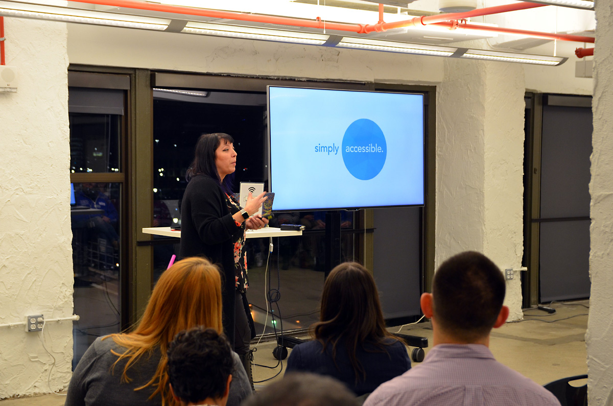
Why is Accessibility so Hard?
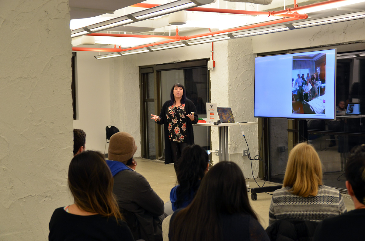
Waters is head of strategy for Simply Accessible and opened her talk with a story about her father and her work at Humana, where she was in charge of web accessibility.
Waters spent two months working remotely in a hospital room while her dad was in the hospital.
Humana had recently finished work on a prescription drug calc tool for the Medicaid site, and usability testing had been conducted on the new tool.
Her father had low vision and had lost vision on one eye. As Waters explained how the tool worked, how easy it was to use, her father saw a fuzzy/unclear picture. He had to zoom in to see anything in the tool.
Which meant he lost context of what he was trying to do, since zooming in meant much of the tool’s options no longer displayed.
It took 5-7 minutes to use the tool for one drug.
Her father took 10 drugs.
And he said to her,
If it’s accessible, why is it so hard to use?
As it turned out, Humana’s usability testing had not included anyone with disabilities. Or a senior citizen.
Do you think something’s accessible or usable? Try doing it 10 times and see if you feel the same way.
What’s the Definition of Accessibility?
Accessibility is for every person, for every device. Making things work for everyone regardless of their abilities.
To achieve accessibility, Waters recommends following the four principles of the Web Content Accessibility Guidelines (WCAG) 2.0:
- Perceivable: text equivalents and alternatives for content
- Operable: make functionality available to the keyboard and assistive technologies. If you could only make one thing accessible, make it accessible to a keyboard. Works with different keyboards and accessible devices that translate into keyboard.
- Understandable: Make content that’s readable, intuitive, and predictable. Make sure things are consistent and predictable. “Make this hard to read” bookmarklet
- Robust: Maximize compatibility with current and future user tools, made much harder by the advent of responsive web design and mobile devices
- There is no way to know how someone is going to be consuming your content.
- The more you make it flexible and adaptable to any kind of user agent or combination of tools, the easier you make it for people with disabilities who may have a very customized set up.
- A lot of senior vice-presidents and managers try to delicately ask this question. “Looking out for the bottom line.”
- One in 7 people in the world have a disability, according to the World Health Organization (WHO) report on disabilities
- That’s 15 percent of the world’s population (in comparison, 3.5 percent of Internet desktop users use Internet Explorer)
- Recognize disability is not either/or. It’s not binary, it’s a spectrum. It’s like a color wheel.
- We have a unique combination of strengths and weaknesses. We want to account for all the different varieties of who they are now and who they become later.
- Pay attention to where questions and answers are grouped together
- Consider using visual weight to differentiate and prioritize options
- Single column may be better than questions and answers spread apart
- The goal is thinking about proximity and about how other people will be using the form
- Try using a screen magnifier
- Premature inline validation, where user’s input is marked as invalid before they have finished typing, i.e. when typing passwords. It’s annoying for us but confusing for a screen reader user, a number one complaint. Form validation needs to be thoughtful.
- Don’t assume that learning disabilities means illiteracy. People confirm ebooks differently, i.e. audiobooks, etc. Learning disabilities and literacy are two different things.
- There’s such a thing as too much contrast and verbosity. Super, super high contrast is pretty disturbing for autism, etc. Be careful and conduct usability testing. Think about how you use fieldsets and legends. (Legends can be problematic on screen readers, when each form field is read aloud, the legend is repeated with each form field label.
Open Signal reports each year on the number of distinct Android devices. And to make their point of Android fragmentation, they created a visual display of different viewports for Android device.
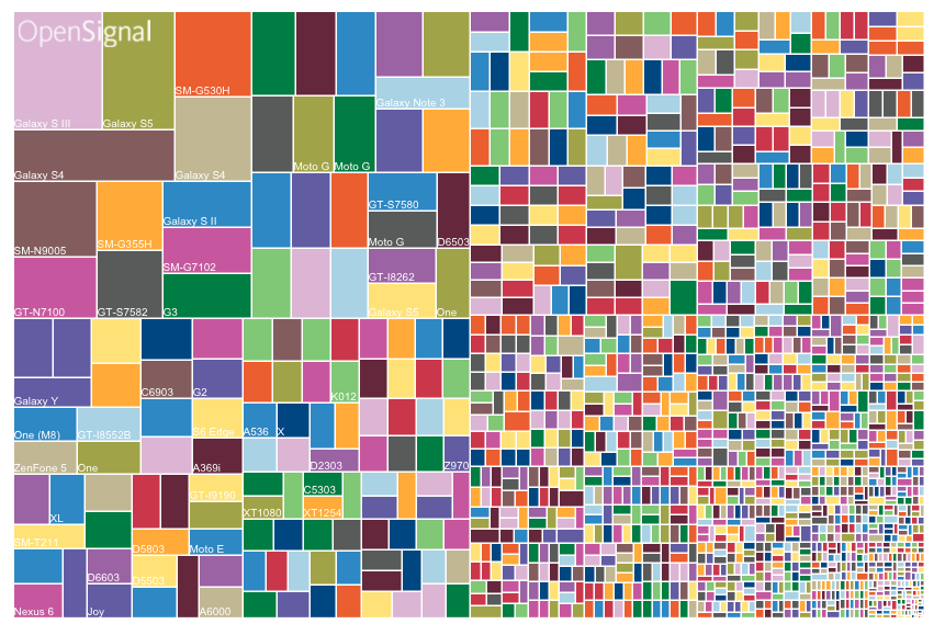
Two takeaways:
How Many People have Disabilities?
How Do We Even Measure Inclusion?
Start with what you know (Web Content Accessibility Guidelines (2.0, 2.1), UX and usability best practices. A lot of things have been squeezed into 2.0 that have been officially included in the upcoming 2.1 version.
User experience (UX) professionals have knowledge of accessibility even if you don’t know it! It’s not that different from typical UX testing.
Looked at past changes at their company to see if just going to UX best practices would have automatically become accessible, over 60 percent of issues could have been solved this way.
Waters shared the story of signing up her sister for Amazon Prime membership. It took seven minutes! Think about how much longer (10x) it would take for someone with disabilities.
Disability is a usability amplifier. Both on the negative side and the positive side.
The more usable your interfaces are, the more likely you will have a delightful user experience for everyone.
And it’s exponentially more delightful for someone with disabilities who has had to suffer with really bad UX for however long.
Recommendations:
Test with real people. Do you do usability testing at your work? For those who don’t, there may be some amazing results that you couldn’t have predicted.
In the end, the measurement of accessibility is whether people can actually use what you built, not professional accessibility testers. For example, someone who lives down the street for you.
Small Steps to Design Inclusively
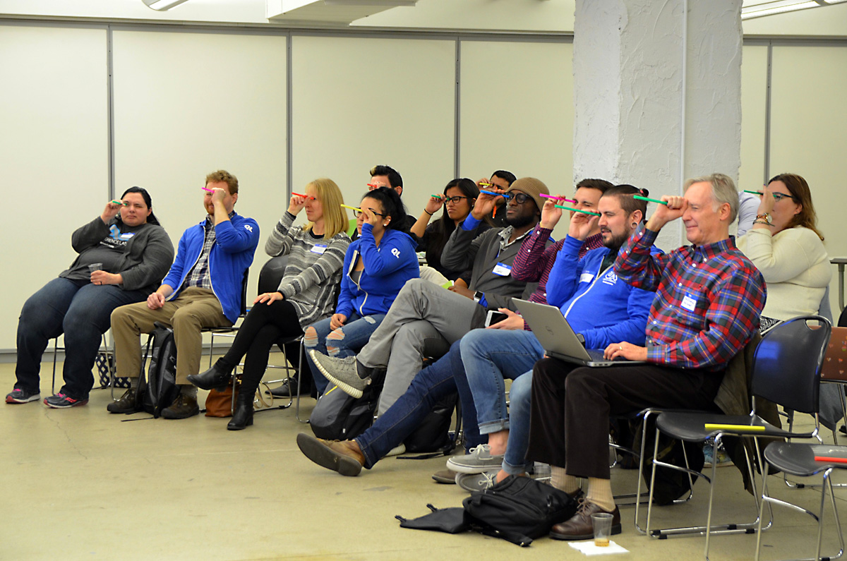
Waters conducted in interactive straw test, asking attendees to close one eye, put a straw up to their other eye and try to fill out a form on the monitor.
The idea is to simulate how people might view your site by limiting your viewport, to mimic how people with low vision would view your site.
The form example she used was accessible to a screen reader and keyboard users, but created issues for people who zoom in to view your form.
Here are tips for improving how you layout forms:
What if you could only navigate via headings? Is it clear what the contents and sequence of the page are?
Another tool you can use is to create inclusive personas. Write profiles for the person (background, abilities, where they work/go to school) and what they want to use the Internet for. And include what their disability is in the persona.
Findings from the Field
Three out of five screen reader users don’t have a monitor. Think about different combinations people may be using to view your website or web application. For example, a smart phone and a keyboard.
They may be being served the mobile viewport but that’s not what they were looking for. Build it well, build it responsibly, and flexibly. And conduct your usability testing.
Other Takeaways
While people with a Mac, iPhone, and Android phone have a screen reader, and you can do testing on your own screen reader, you won’t get the same results as someone who use a screen reader daily.
People with disabilities self-identify differently, “I’m a person with autism” vs. “I’m autistic.” As you talk with people with disabilities, take their lead on how they like to refer to themselves.
Q & A
Question: Should I use a table element for blind users. Is it better or is a list better?
Answer: Tabular data is good because the screen reader can understand it.
Question: What are some disabilities that are hardest/challenging to design for?
Answer: Vestibular Disorder (motion sickness) where they need all animations disabled, or those who are blind/deaf.
Question: I’m getting pushback from clients that accessibility will limit their design. How do you address?
Answer: Actually leads to better design. If you create an accessible interface it will be a more usable interface for everyone.
Shoutout to Mike Wojan for the great photos from World Usability Day Detroit 2017!
If you weren’t able to attend the event, we’ve got video! Check it out (around 55 minutes).
Sponsors
Thank you to Quicken Loans User Experience, The Understanding Group, Vitamin T, User Experience Professionals Association, and Grand Circus for their sponsorship of World Usability Day Detroit 2017.
We couldn’t have held our event without your support!