Recap: Designing in Time Constraints - Experience from Code Michigan 2013

Time has always been a factor in design. Cliff shares his experience from Code Michigan 2013 where he was part of a two-man team that designed an application in a three-day period.

Cliff went through key tips and tricks to design under strict timelines including wireframing and communication with your fellow team mates. Attendees got an idea of how to keep calm and focused during a very tight deadline and to come out on top without losing track of the big picture.

Recap: 25 User Experience (UX) Lessons from Hollywood

In January we were lucky enough to have Steve Tengler give a talk to a joint meeting between Refresh Detroit and the Michigan Usability Professionals’ Association.
His talk built off his ongoing series of articles which explore user experience lessons from actors:

Although Steve couldn’t share his slides here are the 25 UX lessons he demonstrated that we can learn from Hollywood.

The 25 UX Lessons From Hollywood:

  1. Rain Man: Social Media Ratings of UX Can be Powerful (“Kmart Sucks!”)
  2. Mission Impossible: Arrange your User Interface Around Urgent Tasks
  3. Minority Report: Design Your System with a Multimodal Interface
  4. Top Gun: Design for Human Error Upfront
  5. Risky Business: Style Captures Attention
  6. The Green Mile: Task Completion Doesn’t Automatically Equate To Success
  7. Cast Away: Fictional Personas Can Bring Sanity to the Project
  8. Bosum Buddies: Re-Skinning Can Allow Financially-Advantageous Reuse
  9. Da Vinci Code: Complicated Interfaces Have Their Purposes Too
  10. Forrest Gump: Exceeding Expectations Makes You Memorable!
  11. Jurassic Park: The Details Are Surrounded by Dung
  12. October Sky: Have Faith in Iterative Testing
  13. Recount: Statistics Can Be Both Powerful and Dangerous
  14. Blue Velvet: Investigations Can Go Too Far
  15. Meet The Fockers: Understand the Financials of Personalization
  16. Pirates of the Carribean: It’s Not About the Ship You Rode In On
  17. Edward Scissorhands: Plan Ahead for Assimilation
  18. Alice in Wonderland: Flexibility on Size Helps Win the Battle
  19. What’s Eating At Gilbert Grape: Design for What Your Customer Wants
  20. Alice In Wonderland: Tremendous Flexibility Can Lead to User Satisfaction
  21. Bruce Almighty: Silent Analytics Can Help Tailor Your UX
  22. Man on the Moon: Know the Business Side of your Business
  23. Mr. Popper’s Penguins: Watch Out for the X+1 Factor
  24. Horton Hears a Who: Don’t Forget The Minority Might be a Captured Market
  25. Batman Returns: Be Flexible on Emerging HMI

If you have a chance to see Steve talk, take it. He is engaging and has a great insight in to user’s needs. We were grateful to have him and invite him back any time.

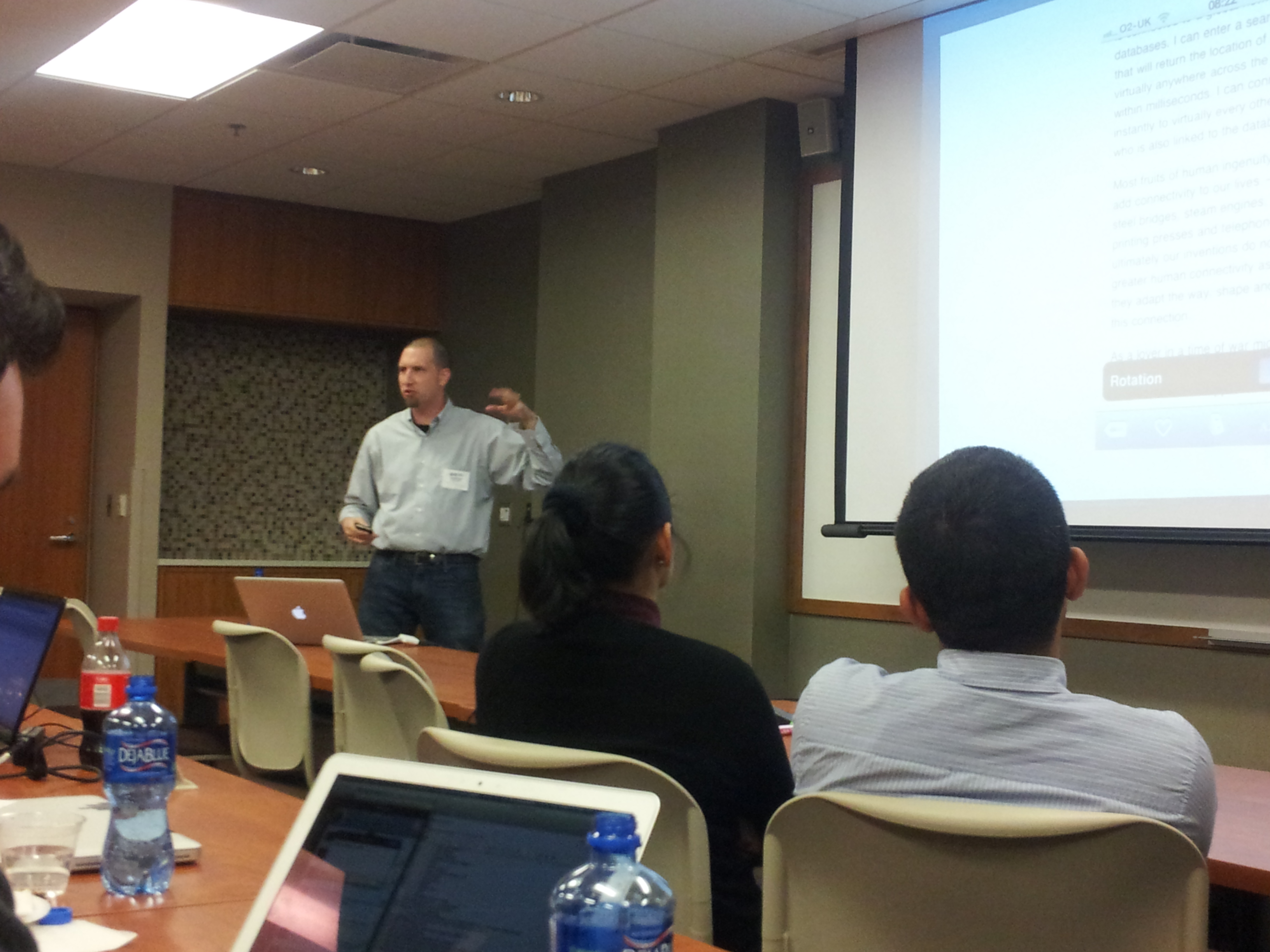
Recap: Brad Colbow - It’s the little things

Last week we were lucky enough to have Brad Colbow talk about designing interfaces for mobile devices. Brad has extensive experience explaining usability and produces a Web comic called “The Brads.”

The Presentation

Notes from the meeting:

  • Brad works from home and has a specific routine that he follows every morning. One day that routine was interrupted because his daughter was having friends over. So he decided to work from a friend’s office which was quite some time away.
  • He decided that he would pass the time driving by downloading an audiobook from his local library. He browsed the website and found the book he wanted. He then went on to download the book and found the experience so frustrating that he made it a topic of one of his cartoons: Why DRM Doesn’t Work.
  • He loves to take dense mental model information and turn it in to a comic strip that anyone can understand
  • Brad’s day job was building magazines for iPad and iPhone. They didn’t have an iPad yet, so they started on the iPhone and thought they could scale up from there. They knew that magazines needed to be better digital than print. They started with the user interaction guidelines that are available for iOS, Android, Blackberry, etc.
  • What is the secret to creating a great user experience?
    • Looking at experiences they liked
    • Listed reasons and tried to figure it out
    • When you study a bad experience you can easily figure it out
    • What could they use as a bad experience? The Library
  • The little details matter
    • On the library website when you browse for audiobooks you see and can search the entire selection. But when you decide on one and are ready to download it you get an “Add to SelectList” option. What is a “SelectList?” It’s not even a real word..
    • In a real library if you can see a book on the shelf, you can check it out. That experience isn’t mirror on the library website.
    • Stuff like this is not nitpicking. It’s not the big thing that gets you, it’s all the little things that bother you over time.
  • Brad outlined some great user experiences, for example using Dribbble on an iPad. iOS will auto capitalize the first word typed, usernames are case sensitive, so when you login to the website you have to be sure the first letter of your username is lowercase. This is a minor inconvenience but because these two systems obviously have their own motivations it is justified. But the developers of Dribbble must have experienced this first had and added “autocapitalize=”off”” to their username field. It is these little details that make it such a great experience.
  • Brad then went on to outline a few UI differences between iOS and Android and why designing a single interface won’t delight the users of both OS’s. The users of each OS are use to a certain button placement and experience.
  • Some best practices
    • Don’t let the UI hinder the experience
    • Be Skewmorphic sparsely
    • Elevate the content people care about
    • Mobile websites are to do something one time and be done with it. Don’t put an ad on your site to download the app.
    • Avoid forcing the user to rotate the device
    • Don’t make up new touch gestures
    • Avoid help. If you need an instruction manual, you’re doing it wrong
      • If your app needs help, your app needs help.

Full presentation available at: https://speakerdeck.com/u/bcolbow/p/its-the-little-things